Orchard Lodge Branding
Category
Branding, Graphic DesignOrchard Lodge Branding
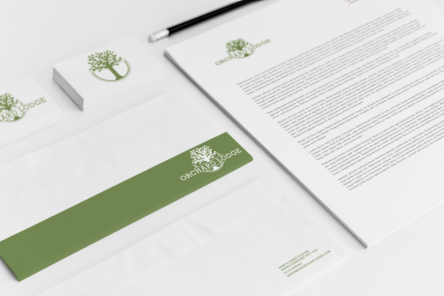
Orchard Lodge had been a client of ours for a number of years when it was bought and transformed by Andrew & Lucinda Jenkins. This husband and wife team completely overhauled this ageing bed and breakfast and turned it into a dream countryside escape.
As part of the overhaul, they required a new logo that would appeal to their new target demographic – countryside enthusiasts such as ramblers dog walkers and wildlife photographers. With this in mind we went with a countryside inspired ‘cooking apple’ Green for the main colour on the apple tree logo, coupled with a friendly but mature typeface which gives the branding a feeling of comfort and wellbeing.
Andrew and Lucinda were more than happy with this, and went on to have us build them a website as well.